Prix du XXe siècle Recipients
2020 | 2019 | 2018 | 2017 | 2015 | 2014 | 2013 | 2012
2020
Award of Excellence
Niagara Falls Butterfly Conservatory – Niagara Falls, ON
Architect(s): Baird Sampson Neuert Architects
Photo Credit: Richard Seck
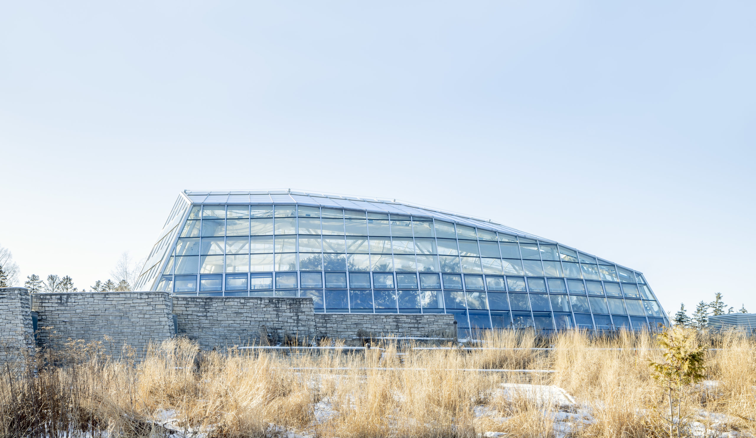 The Niagara Parks Commission’s Butterfly Conservatory is an exemplary complex of glass buildings dedicated to the public display and rearing of live butterflies. Completed in 1994, it remains the largest and most northerly facility of its kind in North America. At the time of opening, it was celebrated in the Economist as a landmark international achievement. It quickly became a “must-see” attraction in Niagara Falls.
The project was conceived as a year-round attraction to compliment the nearby Niagara Parks Botanical Garden. The building also expanded educational opportunities for students of the Niagara Parks Horticulture School.
Energy efficiency was an important consideration for the “integrated design” approach taken by the architecture and engineering team. The designers focused on issues of envelope performance and endeavoured to learn from the production greenhouse industry. The design of all building systems was considered holistically, including their potential manage natural air movement. Butterflies only fly in daylight, so natural lighting was at the forefront of systems integration efforts.
Photo Credit: Richard Seck
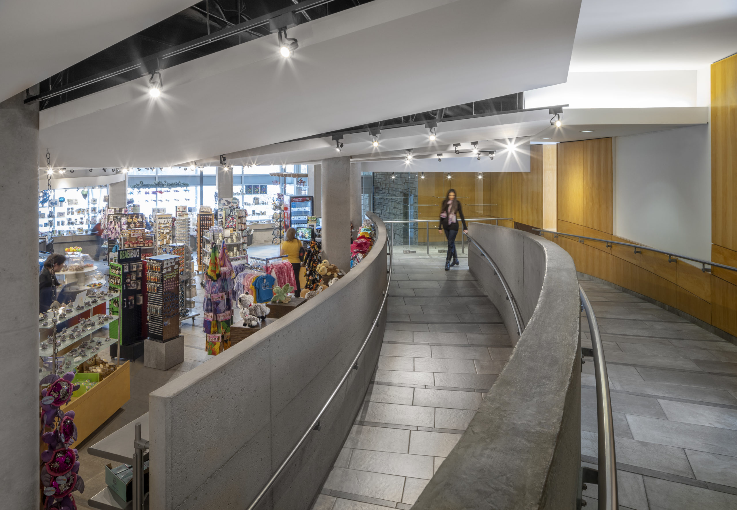
The care with which the Butterfly Conservatory was planned and designed has resulted in an exceptional history of operational success over 25+ years. Close to 8 million people have visited the facility. On a busy day, 2,000 visitors pass through its doors. Satisfaction for visitors and staff remains very high—and the building operates as intended.
Jury Comments
“This project exemplifies a holistic approach to architecture in its sensitivity to the site, its materiality, its architectural expression and its response through research and technology to the demands of its unusual program. Anchored to its context and yet expressing a very Canadian aesthetic sensibility, the building is an enduring and quality example of environmentally sensitive architecture that foreshadowed the sustainability concerns of the 21stC.
Choosing the Butterfly Conservatory strongly illustrates the value of the Prix du XXe Siecle award. It is a project that may not have been at the height of architectural fashion when it was completed in 1996, but with the benefit of hindsight, we see a building that has stood the test of time and was a forerunner in what we now understand as sustainable design. The conservatory design is based on careful problem solving, the use of natural, durable and repairable materials and a poetic engagement with the landscape. These elements alone make this project stand out and offer guidance to contemporary architects.”
Back to the top
Certificate of Merit
Humber Bicycle and Pedestrian Bridge – Toronto, ON
Architect(s): Montgomery Sisam Architects
Photo Credit: Robert Burley
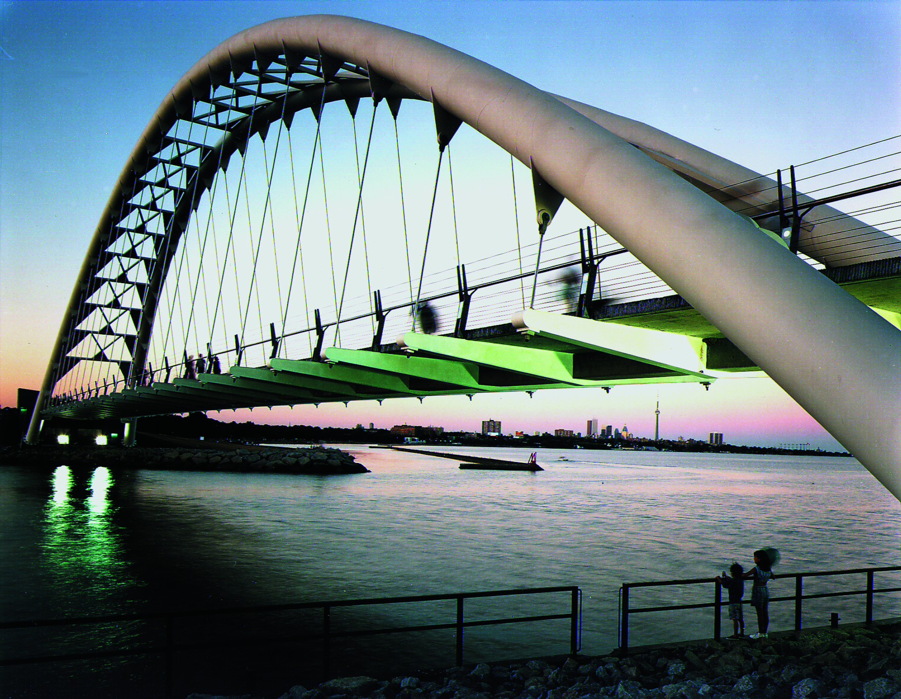 The Humber River Bicycle and Pedestrian Bridge provides a vital link to the waterfront trail system along the shore of Lake Ontario. The design called for an integrated team of engineers, architects, landscape architects and artists, so that the project could provide a narrative of the cultural and natural heritage of the site.
The tied-arch form and cairn-like concrete abutments mark a gateway to what was once a historic trading route of Eastern Woodlands Indigenous peoples, who frequented the site for over 200 years. The steel superstructure connecting the two tubular arches is patterned with an abstract image of the Thunderbird—ruler of all airborne species—an icon of these Indigenous peoples. Etched panels depicting the site’s complex history are located on walkways beneath the bridge deck. Snake and turtle motifs were incorporated in recognition of the natural world at the mouth of the Humber River.
Structurally, the bridge’s post-tensioned concrete deck is supported by steel beams suspended by stainless steel rods from two parabolic steel arches. The superstructure was fully constructed on the banks of the river before being hoisted into position by a crane and a barge.

In his memoir “Witness to a City,” former Toronto mayor David Miller writes that the Humber River Bridge “stands for the idea that public investments in great public places have enduring value, and that public money can and should be invested in beautiful places that benefit us all.”
Ultimately the bridge is a place of connection: between Toronto and Etobicoke, but also between the past, present and future.
Jury Comments
“This contemporary project successfully incorporates iconic aspects of the history and culture of the site while responding to the current needs for pedestrian and bicycle infrastructure.
The Humber River Bicycle Bridge represents a unique collaboration of design disciplines that has resulted in a beautiful engineering and architectural work. It is also a forerunner in the creation of non-motorized transportation infrastructure and has become a landmark in the community.”
Back to the top
2019
Royal Manitoba Theatre Centre – Winnipeg, Manitoba
Architectes: Number TEN Architectural Group
Photo Credit: Leif Norman
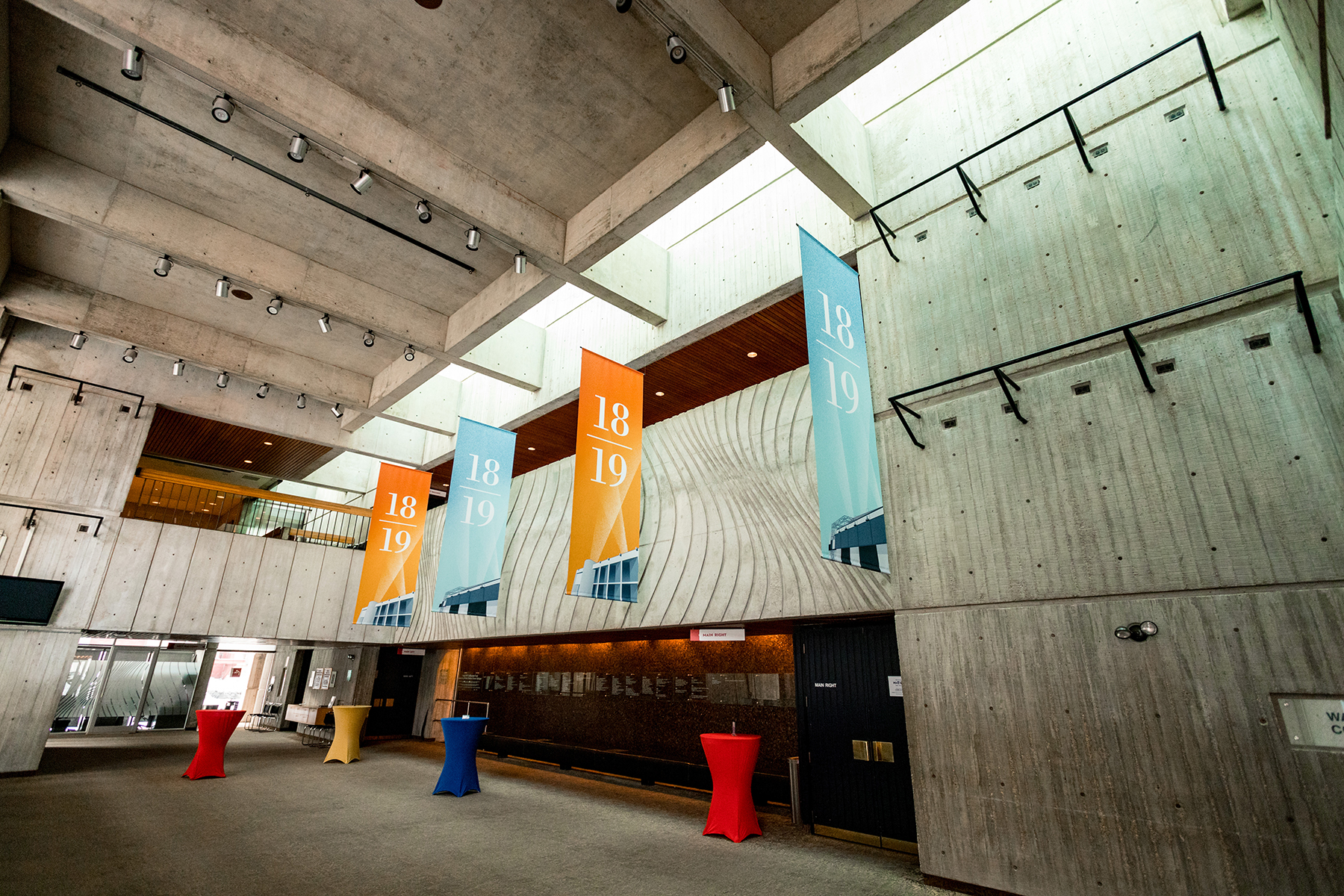 The Royal Manitoba Theatre Centre (RMTC), opened in 1970, was designed by Number TEN Architectural Group (originally called Waisman Ross Blankstein Coop Gillmor Hanna) of Winnipeg.
Manitoba Theatre Centre was the first regional theatre in Canada and was founded in 1958 by John Hirsch and Tom Hendry. Hirsch went on to a distinguished career at Stratford Festival and other venues, while the Manitoba company thrived and inspired the development of regional theatre across Canada. The Royal Manitoba Theatre Centre is recognized as a National Historic Site of Canada, both for the company’s influence on the development of Canadian theatre and as an expression of small-scale Brutalist architecture in Canada.
The principal architect for the 785-seat theatre was Allan H. Waisman FRAIC and the design architect was Robert Kirby, who worked closely with the artistic director of the theatre company, Eddie Gilbert. RMTC is one of only three National Historic Sites in Canada designated for the excellence of its Brutalist architecture. The other two are Charlottetown’s Confederation Centre for the Arts and Ottawa’s National Arts Centre.
The members of the jury praised the RMTC’s design for creating “theatrical intimacy between audience and actor.” The foyer includes viewing windows to the backstage area, where theatregoers can see all the aspects that go into a production. “It promotes an awareness and appreciation of the relationships between those behind-the-scenes, those on stage and the audience, a casualness of contact. It explores the social, the political, the material and the place as conditions for creativity and innovation.”
Architectural historian Andrew Waldron says: “A thrust stage, calm semi-private spaces, and public viewing of behind-the-scenes are only a few elements of how the architects introduced a more intimate and informal experience within a Brutalist space. These qualities have remained intact. Indeed, in contrast to other Brutalist works, the RMTC has retained its integrity with few alterations since construction. Its architectural integrity is a testament to its functional and material success.”
The nomination also notes how the building contributes to the two streets it faces, and the uniqueness of its auditorium design, with an irregularly shaped balcony extending over the orchestra and a flexible stage that can project and recess through the frame of the proscenium. Other notable features are continuous skylight on two sides of the auditorium and the high quality craftsmanship of the exposed concrete.
Back to the top
2018
Toronto Central YMCA – Toronto, Ontario
Architects: Diamond Schmitt Architects
Photo Credit: Fiona Spalding-Smith
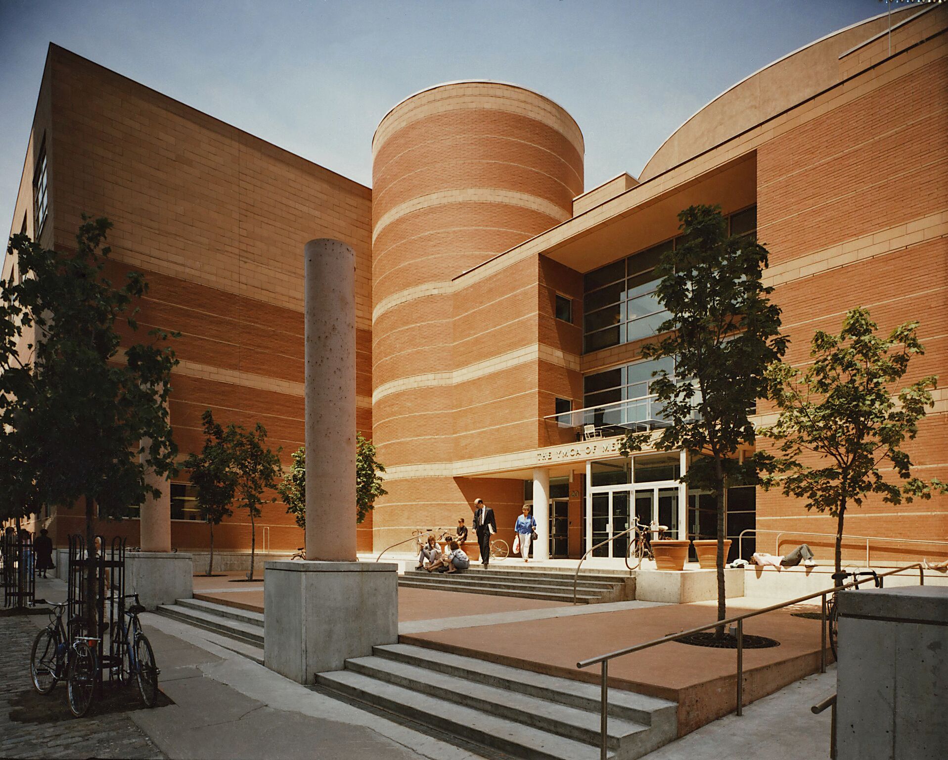 The YMCA was established at the end of the 19th century to accommodate Christian youth migrating from rural to urban life. By mid-century, this was no longer necessary, and the Board of the Metropolitan Toronto YMCA dropped the hostel function. The religious aspect became more muted, and the “Y” promoted inclusion of a diversifying society. In deciding to replace its inadequate central facility, the board sought a fitting design to reflect its new mission.
Designed by Diamond Schmitt Architects, the new Y was popular from the day it opened in 1984: Membership rose beyond all expectations, program participation increased, and the loyalty of members has become legendary.
The building utilizes large functional volumes connected through logical, yet exciting corridors that encourage the experience of public passage through the building and civic block. These circulation paths are used as a means of visual access into program areas and as socializing devices; even non-members can look into the spaces containing pools, gymnasia and pass through the central performance area and a virtual common. The building makes use of raw concrete, masonry block and locally sourced brick, materials whose permanence is fitting for a venerable public institution.
After almost 30 years, Diamond Schmitt undertook a renovation and expansion of the facility between 2011 and 2012. The renovations focused on the north wing of the building and the south main entrance. A glass box addition on the south exterior provides an accessible main entry vestibule on the ground floor. The renovations also included the addition of a community meeting room and the Community Newcomer Information Centre. Beyond the expected weathering of a 34-year-old building, the YMCA’s condition is in extremely good shape. “This is a testament to the robust execution of the architecture, especially surprising given the number of users throughout the building,” said the jury.
Back to the top
2017
CN Tower – Toronto, Ontario
Architects: John Andrews International/Roger du Toit, The Webb Zerafa Menkes Housden Partnership (WZMH), and Associated Project Architect, Edward R. Baldwin
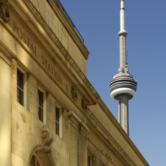 Rising 553.33 metres above the Toronto skyline, the CN Tower celebrates structural innovation while providing a symbol for Toronto recognized worldwide, and a major tourist attraction, drawing more than two million visitors annually.
Webb Zerafa Menkes Housden Architects with John Andrews Architects International worked alongside engineers and contractors to produce creative designs and construction methods.
The tower was conceived as a telecommunications facility to address communications problems caused by the growing numbers of high-rises; they compromised broadcast signals, creating poor television and radio reception.
The Canadian National Railway’s solution was to build a TV and radio communication platform to serve the Toronto area, as well as to demonstrate the strength of Canadian industry and CN in particular. With its microwave receptors at 338 metres (1,109 feet) and the 553.33 metres (1,815 feet, 5 inches) antenna, the CN Tower solved the communications problems for Toronto and the surrounding region.
As the design evolved, it took its current form of three legs extending from a single hexagonal core, creating its iconic ‘Y’ shape base, which narrows gracefully, extending finally to the antenna. The tapering wings rise to 330 metres, the concrete tower to 450 metres. These tapering wings allow the tower to withstand an earthquake of 8.5 on the Richter scale. The upper reaches of the CN Tower were built to withstand winds up to 418 kilometres per hour.
The Skypod was a later addition. Realizing that the tower could become the world’s tallest structure, the architects incorporated an observation deck to accommodate an anticipated influx of tourists.
For some 34 years, the CN Tower held the title of World’s Tallest Free-Standing Structure.
In June of 2016, Toronto celebrated the CN Tower’s 40th birthday.
Jury Comments
“The CN Tower is an incredible achievement of Canadian engineering and construction that pushed the boundaries of concrete technology and slip form techniques to a scale never before undertaken.”
“The structure is a timeless silhouette on the Toronto skyline that has stood sentry over the remarkable development of that city’s downtown over the past four decades.”
“A classic building that is a true synthesis of architectural form and engineering.”
“One of the world’s best-proportioned communications towers.”
Back to the top
Ontario Place – Cinesphere and Pods – Toronto, Ontario
Architects: Eberhard Zeidler (then of Craig Zeidler Strong, now Zeidler Partnership Architects)
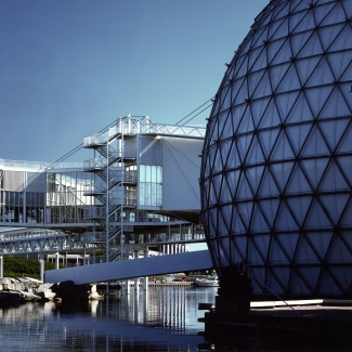 Eberhard Zeidler, FRAIC, recipient of the RAIC Gold Medal in 1986, proposed that Ontario Place be inserted in and over Lake Ontario. His design consisted of the Pods, five interconnected mast-hung pavilions; and the Cinesphere, a “triodetic” dome that housed the world’s first permanent IMAX cinema.
Over the years, the site was altered (though not the Cinesphere and Pods), which obscured the original design somewhat. In 2013, however, the Ontario Ministry of Culture, Tourism, and Sport conducted a heritage study that concluded: “Ontario Place is a cultural heritage landscape of provincial significance.” Accordingly, Ontario Place is now subject to the Ontario Heritage Act, and its future managed in part by a conservation plan respective of the Act’s standards and guidelines.
The striking Cinesphere – also known as “the Bubble” – is a 35-metre-wide dome made from steel and aluminum tubes. The structure is similar in design to the famous geodesic dome, designed by Carl Zeiss and developed by R. Buckminster Fuller.
The Pods’ first function was to host an elaborate multimedia exhibition, though their simplicity makes their program flexible. Despite the unique aesthetic of the bridge-like suspension structure that elevates the Pods over the lake, at the most basic level, each Pod is a 743-square-metre, three-storey box.
Jury Comments
“The Ontario Place Pods’ elegant structural system, combining light tensile cable supports and compression steel masts, were superbly detailed, with very beautifully expressed connections and joints.”
“While at present, the Cinesphere and Pods no longer house the functions they were originally designed for, they still exhibit all the strong design presence they did when they were first completed.”
“The Ontario Place Cinesphere and Pods are a dramatic creation emulating for Toronto and Ontario, the great architectural and social success of Expo ‘67 in Montreal.”
“The Cinesphere and Pods realize in tangible physical form some of the most ambitious Utopian architectural ideas from Europe and the United States of the 1960’s, such as the sky cities imagined by designers such as Yona Friedman, and technological fantasies conceived by the Archigram group in Britain.”
“They are a compelling example of two major design tendencies of their period, the “megastructure” and “high-tech” design.”
Back to the top
2015
Fathers of Confederation Buildings Trust – Charlottetown, Prince Edward Island (1964)
Architects: Affleck, Desbarats, Dimakopoulos, Lebensold, Sise, (later ARCOP, Architecture49 Inc.)
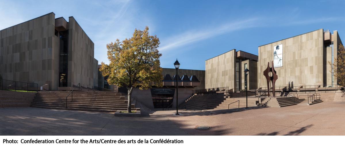 The Fathers of Confederation Buildings Trust, known as the Confederation Centre of the Arts, is an exceptional architectural tour de force of the mid-20th century. Built to commemorate the centennial of the 1864 Charlottetown Conference and as a memorial to the Fathers of Confederation, it is an active monument, offering an ensemble of spaces enabling Canadians to give full expression to their culture. The design by Montreal architect Dimitiri Dimakopoulos was selected by a national competition that included submissions from a broad spectrum of Canadian leading designers. The Centre’s novel combination of uses – theatre, library, gallery, memorial hall – expresses the cultural awakening that characterized the Centennial spirit of the mid-1960s. The mix of cultural spaces and the abstract architectural composition were deeply influential in many Centennial projects to follow across Canada.
Known for its innovations in stage design, the Centre enjoys layered spaces that effortlessly balance monumentality and intimacy evident in few other places in Canada. The sculptural interplay of abstract building forms with courtyards and landscape terraces is expressed in a robust yet refined Brutalist language of concrete and sandstone, and subtly integrates the neighbouring historic Province House into one unified block perfectly scaled to Charlottetown’s urban core. Fifty years on, lovingly maintained with subtle adjustments enhancing its functions and architectural qualities, the Centre remains both a key fixture of the daily life of Charlottetown, and an icon of the optimistic spirit of Canada’s centennial era. The jury unanimously agreed that the Confederation Centre for the Arts merited the 2015 Prix du XXe siècle.
Back to the top
2014
Strutt House – Aylmer, Québec (1955-1956)
Architects: James W. Strutt
Photo Credit: Courvette-Ottawa
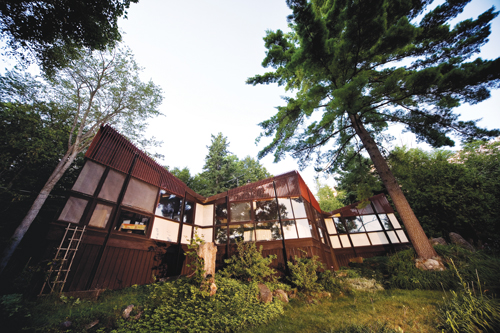 Canadian architect James W. Strutt, is one of many architects who consider his own house to be a “signature piece” of his long and distinguished career.
Located in Aylmer, Quebec, the building is a deceptively simple integration of structure, building science and planning. The house is one of the first in Canada to utilize a “curtain wall” as the building envelope. The wooden hyperbolic paraboloid roof was not only the first in the country, but of its particular construction anywhere.
Strutt knew Frank Lloyd Wright, and the latter’s influence on his education is evident in the detailing of the building construction. The siting below the crest of the most southerly slope of the Gatineau Hills, the integration of the house with its site, the use of natural materials and the core as hearth surrounded by service and served areas, all reflect aspects of a “Wrightian” influence.
However, Strutt’s friend Buckminster Fuller had a far greater impact on the building design and structure. The overall shape of the house results from the intersection of eight rhombic volumes, each based on a grid generated from the same geometry.
This design, and the minimal use of structural material, reflects the growing interest Strutt had in Fuller’s work in geometry and weight efficiencies.
The building was built by a carpenter and helper in about six weeks in 1955-1956. For the most part, it is not attached to its footings. It did not comply with applicable building codes when constructed, and does not do so today.
(Excerpt from a presentation by Titania Truesdale.)
Jury Comments
“A rare and extraordinary example of Canadian modern architecture which remains a defining work of a significant post war Architect. Jim Strutt designed his 1956 home, experimenting with the first wooden hyperbolic paraboloid roof in Canada, which enabled him to create large expanses of glass and undulating ceilings, simplified lines and a refined esthetic quality. At the same time it led the way in demonstrating how to build a low impact, low cost structure which could be sensitively and lightly integrated into the natural environment.”
Back to the top
Toronto City Hall and Civic Square – Toronto, Ontario (1965)
Architects: Viljo Revell and John B. Parkin Associates
Photo Credit: Applied Photography Ltd.
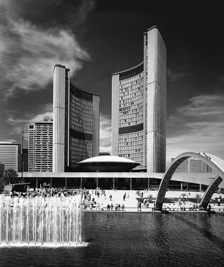 In 1958, Toronto Mayor Nathan Phillips supported an international competition for a new city hall that put the city and Canada at the center of global architectural interest.
The competition attracted 520 entries from 44 countries and was won by a team led by the Finnish architect Viljo Revell. He affiliated with John B. Parkin Associates and the building was completed by 1965.
The modern sculptural design features two curving office administration towers of unequal height, which partially surround the central council chambers in the form of a domed saucer. These elements rise out of a 2-storey podium block facing onto a large civic square to the south. The square is an integral part of the design composition, a modern piazza defined by a surrounding raised walkway. The plaza contains a reflective pool/ ice rink spanned by three concrete arches; a sloping ramp that rises to the roof of the podium; as well as a large central hardscape plaza that provides a venue for major public events. It was a forward looking vision that spoke to the city that Toronto would become, and was a powerful symbol of democratic municipal governance.
As we approach the 50th anniversary of its opening, the City Hall remains a landmark and internationally recognized symbol of modern Toronto.
Jury Comments
“Toronto City Hall and its civic square are an iconic work of Canadian modern architecture. Together the highly symbolic yet functional building complex, and the eminently public space, provides an important centre to the downtown. The result of a critical international competition, which introduced the influence of the Finnish architect Revell to Canada at a key moment in the city’s development, it is perhaps the most enduring Canadian example of the 20th century municipal public space and building. It has continued to serve its original purpose, and is well loved by the community it serves. Its generous public spaces, lyrical forms, dignified materials and refined details serve as a constant reminder to citizens of the value of greater civic vision. Recent rehabilitation work has generally embodied the spirit of stewardship required to maintain our significant public heritage.”
Back to the top
2013
Massey College – Toronto, Ontario (1962)
Architects: Ron Thom (with Thompson, Berwick & Pratt)
Photo Credit: ERA Architects
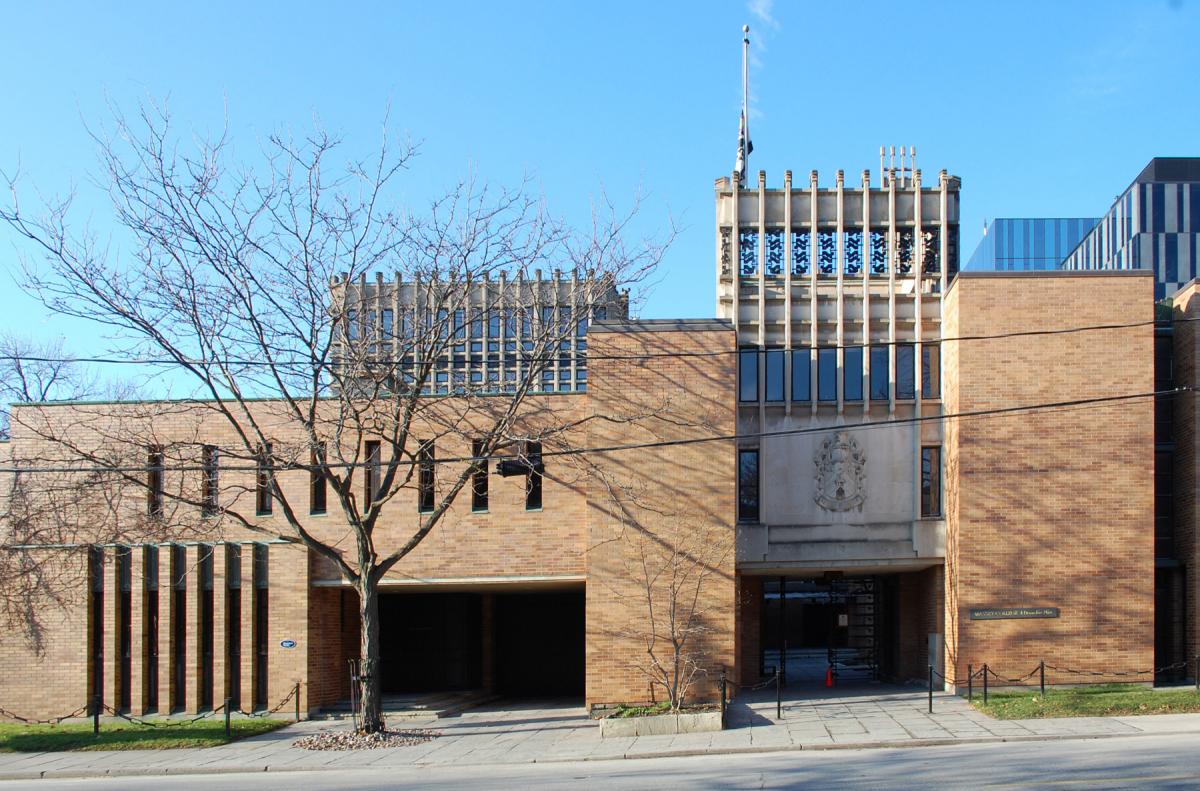 Currently celebrating its 50th anniversary, University of Toronto’s Massey College (1963) is one of the most admired buildings on a campus rich with admired buildings. Designed by renowned Canadian architect Ron Thom, the College successfully achieves its project requirements, responds thoughtfully to its architectural context, breaks with trends of the day by folding several historical forms into a single form, and creates a stunning precedent anticipating design trends in Canada and internationally.
To this day Massey College remains a resilient, much-loved building that has required few changes, even a half-decade after its construction.
The College was a gift from the Massey Foundation intended to create a special place to nurture learning, the intellect, and the public good. Thom’s design was chosen in a competition that did not specify style, but which called for an arrangement recalling the English colleges of Oxford and Cambridge.
In response to this call for academic dignity and intimacy, Thom created a cloistered, inward facing plan similar to the “Oxbridge” tradition. The plan is an open rectangular courtyard surrounded by three three-storey residential wings and one four-storey wing.
In 1989, in recognition of its architectural significance, Massey College was designated under Part IV of the Ontario Heritage Act.
Jury Comments
“Massey College is a skillful and humane interpretation of Arts and Crafts sensibilities in a modernist idiom. It is remarkable for its seamless integration of exterior and interior design, including the rich detailing of its custom furnishings and fittings. It has aged well, and is one of the University of Toronto’s most treasured modern buildings.”
Back to the top
Grande Prairie Regional College – Grande Prairie, Alberta (1974)
Architects: Douglas Cardinal, FRAIC
Photo Credit: Rob Ganzeveld
 Grande Prairie Regional College is an early representative work of a prominent Canadian architect, an instantly recognizable structure which is a significant landmark in Northwestern Alberta, and a building which for more than three decades has helped build the sense of community in Grande Prairie.
When it opened its doors in 1974, it was one of only three Canadian post-secondary institutions located north of 55 degrees latitude. Since its completion, the Grande Prairie Regional College designed by then young, maverick architect, Douglas Cardinal, FRAIC, has become a landmark.
Cardinal blended his structure into the landscape to achieve a striking aesthetic, and the building is equally striking from within. The curved classroom walls and open spaces are special, particularly compared to the utilitarian style which dominates so many campuses. But its role goes beyond campus to community building. It was long the largest public space in the city and the amphitheater routinely hosts community and travelling theatre, public lectures, and a range of musicians and comedians.
On any given day, the campus reverberates with the sound of its classes, its students and also its community. This is a place where the people of this region come together to create, celebrate and share cultural moments.
Jury Comments
“This is a strong example of Cardinal’s early work and his first institutional building. His highly individual approach has shaped a building that has become a regional landmark. It is valued highly by the College as a working environment and an embodiment of a distinctive understanding of place and people.”
Back to the top
2012
Hemingway Fitness and Leisure Centre – Edmonton, Alberta (1970)
Architects: Peter Hemingway
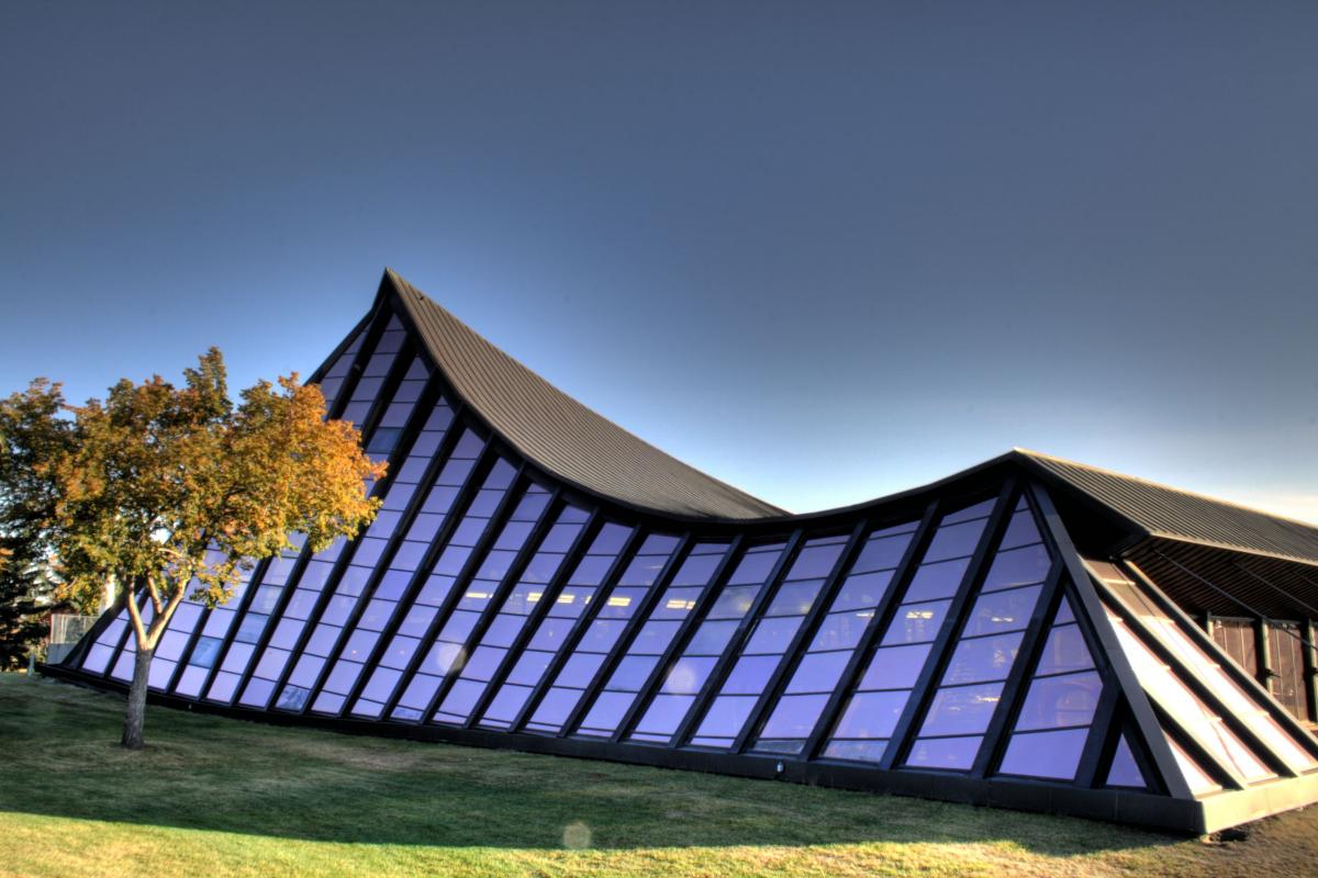 The Hemingway Fitness & Leisure Centre by Peter Hemingway was commissioned as a project to mark Canada’s centennial for Edmonton. Originally named Coronation Pool this stunning facility displays a flowing-wave in its roof structure suspended with cables and bold outlines made with contrasting materials such as heavy timber, concrete, steel and glass. The facility, completed in 1970, reflects the modern architecture movement of the 1960s in Canada’s prairie provinces.
The shape of the building steps away from the typical boxiness, found internationally at that decade, and references the Rocky Mountains, the foothills and the rolling flatlands of the prairies. Hemingway felt that the most powerful Canadian buildings from the post-war era were erected in the prairies “out of [a] harsh necessity for strong forms in a landscape wide as Heaven or Hell.”
Peter Hemingway’s unique structures beautify and enhance Edmonton’s landscape, and continue to amaze and inspire architects, citizens and visitors alike.
Jury Comments
“It is a nationally-significant example of the architectural creativity and confidence engendered by Canada’s centennial celebrations. Its design reflects a particular Modernist response to the Prairie landscape, the setting for some of the most powerful Canadian architecture of the post-war era. It expresses a delight in the potential of new technologies, with its inventive mix of glass, steel, heavy timber, and concrete. The flowing wave form, reflecting the pool within, gives it a certain uniqueness within the more prevalent rectilinear Modernism of the time.
Its significance has endured not only because of its iconic design, but also because of the high level of maintenance and care over the years. It continues to serve its original use. Both the building and its architect were warmly embraced by the community, and have served an important role in terms of local and regional pride and identity.”
Back to the top
